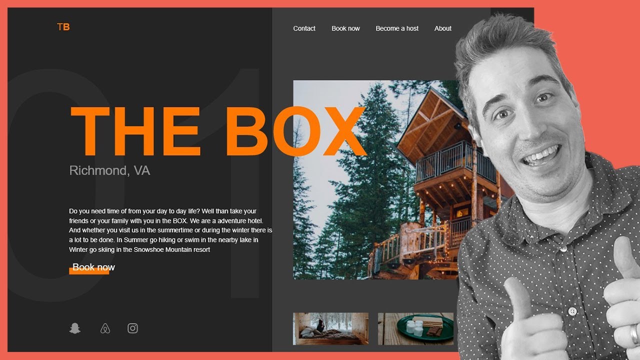
יצירת עיצוב רספונסיבי ואסימטרי עם HTML ו-CSS

דרג סרטון זה
התחבר כדי לדרג
תיאור
Layouts like this used to be a huge pain, but with the more modern tools that are being introduced to CSS, like grid, subgrid, flexbox and some fun functions like clamp() things are getting *so much easier*!
Moritz's Instagram: https://www.instagram.com/mei.moritz/
Finished code: https://github.com/kevin-powell/TheBox
0:00 - intro
2:05 - project starts
10:00 - starting the CSS (mobile-first)
31:43 - setting up the grid
37:30 - setting up the subgrid
48:15 - adjusting for bigger screens
--
Come hang out with other dev's in my Discord Community
https://discord.gg/nTYCvrK
---
Keep up to date with everything I'm up to
https://www.kevinpowell.co/newsletter
---
Help support my channel
Get a course: https://www.kevinpowell.co/courses
Buy the t-shirt: https://teespring.com/stores/making-the-internet-awe...
Support me on Patreon: https://www.patreon.com/kevinpowell
---
My editor: VS Code - https://code.visualstudio.com/
How my browser refreshes when I save: https://youtu.be/h24noHYsuGc
---
I'm on some other places on the internet too!
If you'd like a behind the scenes and previews of what's coming up on my YouTube channel, make sure to follow me on Instagram and Twitter.
Instagram: https://www.instagram.com/kevinpowell.co/
Twitter: https://twitter.com/KevinJPowell
Codepen: https://codepen.io/kevinpowell/
Github: https://github.com/kevin-powell
---
And whatever you do, don't forget to keep on making your corner of the internet just a little bit more awesome!


![קורס מזורז למתחילים ב-Git & GitHub [2026]](https://img.youtube.com/vi/mAFoROnOfHs/mqdefault.jpg)